Blog Task 8: Final Reflection

Before my Photoshop tutorials I had never had any experience using the software. I initially found it quite difficult, especially as I had also had no previous experience using mac computers. However, it became a lot simpler once I spent some time using them and having others around me who could help and advise also made the learning curve a lot shorter.

I very much enjoyed using the software. I enjoy photography myself and although I have used apps for adjusting things like saturation and shadow on my photos, Photoshop opened up another world of possibility for me. I suddenly had much more room to do what I liked with my pictures and the assignments given were flexible enough to allow me to explore these possibilities further. It also opened my eyes to just how much the media can distort the truth through images and that the expression” the camera never lies” can no longer be taken at face value. My experience helped me become more critical towards the media while also allowing me to appreciate other artists visual designs more as I now have a better understanding of how much work goes into creating them.

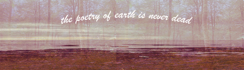
Being given more room and opportunity with Photoshop developed my visual design skills by giving me more options to think outside the box with a new set of techniques previously unavailable to me. The WordPress banner for example allowed me to combine images and text to create something different that I would have not been able to do before. It allowed me to express my vision in a new way and to further realise the capabilities of visual design.

My favourite Photoshop blog task was definitely the packaging revamp. As it was something I hadn’t done before it pushed me to think outside the box by making me view a package design as not just what it is but what it could be. It also allowed some humour to be brought into the mix which was quite enjoyable for me. I was able to put my idea into what I thought of the product into reality; to an extent. It was still just the image that was changed but it brought to light the possibilities of design and how the creator has the power to change something to suit their own idea.

Ultimately the course felt too short and I would have liked to have had more time to explore other Photoshop skills as well as to have more time to become comfortable with the ones I did learn. Some other aspects of Photoshop I would have enjoyed learning would be in the enhancement side of things such as sharpening and adjusting pictures. As I mentioned I enjoy photography so this would have been something I would have found useful. Although these weren’t covered in the tutorial I believe that with some of the basics of Photoshop under my belt I will be able to pursue them myself in time.


Blog Task 7 – Remix packaging Exercise.

In our recent assignment where we had to “upgrade” packaging of our choice I  decided to use a tin of Tesco chickpeas. As a child the name always confused me and made me think of chickens so I was always surprised when the contents were closer to beans than anything else. I decided to play on this notion in my design by amplifying up the concept of the “chicken in water” theme. Here I used Photoshop to change the text from “chickpeas” to “chickens” in order to further strengthen the image of the chickens in the tin. I also added a picture of a chicken in place of the chickpeas. I refrained from using a photo of a chicken as I felt it would class with the tins original simplistic design and instead opted for a simple drawing that I felt gave across a homely feel of traditional farms and therefore more suited the product. I wanted it to look like something people might actually buy so it was important that it look appropriate and not too much like a joke. I was amazed at just how easy it actually was to change the entire idea and meaning of a product with just Photoshop. With  a few small steps it has become an entirely different product and t shows the power a small word change or image can do.chickens in water

Blog Task 6-WordPress Banner

I recently changed my WordPress banner on Photoshop using my own photos as I felt this would help me better express and represent myself on my site. The two images I used where taken in Ireland in places I felt were truly beautiful. Both showcase two very contrasting sides to the natural beauty of this country. Nature has always been important to me and I wanted my banner to reflect this.

One of the photos was taken in a forest in Westmeath and the other on the beach in Donegal. At both places I was with friends and family and was truly in the moment. Being outdoors is something I enjoy and to share that with others is even better. I believe this is something everyone can enjoy as there are so many different landscapes for us to explore.

I chose to contrast these two images to show that although there are many differences between the different sides of Ireland, from rocky coastline to wooded forest but that together these images combine to form a complete picture of our landscape.

I adjusted the colours of the banner to give it a softer feel and allude to a soft sunset. I felt this palette change helped the images fit together better and also gave it a more aesthetically pleasing feel as I am personally a fan of soft nudes and pinks.

Finally I added text. I chose the phrase “the poetry of earth is never dead” as it reflects my belief that you can never run out of things to discover in nature and it will continue to keep surprising you as long as you have an open mind and remember to look around.


Blog Task 5 – Critical Analysis of Web Interface

The web interface I will be discussing today is the Ticketmaster web page. This site is used for selling concerts to various events, mainly concerts. It has clear purpose to be easy to use and does not need to tell a story, this is reflected in its design.

This site follows the trend of 21st century minimalist design with a flat look and no attempt made at adding texture or any 3D elements. The main colour used is white as this is the background colour and not much has been put on top of this. The two colour for text are blue and black and the font is not a very bold one. The main source of colour comes from the various photos of the acts. This keeps the focus of the site on the acts and events they are trying to advertise and sell pictures for rather than on the site itself.

The site is very readable with two direct menu bars for the user to navigate through and the newest and most popular events featured in the centre. Everything can be found from a quick glance at the home screen which increases the ease of navigating through it.

Although the site clearly gets its point across; to sell tickets, it could improve its site with a more aesthetically pleasing design. Its simple style is for the purpose of keeping its interface easy to use but this could be maintained while incorporating some newer elements such as picking the pictures of the acts based on a certain theme such as black and white. The same layout could be kept with the font and design of the menu and search bars being changed.

Overall I find the site stays true to its story by making usability its priority but there is still room for development in the aesthetically pleasing department.


TicketMaster

Blog task 4-social media privacy

I recently went into all of my social media accounts in order to check my privacy settings on various inform I had filled out about myself. This was an interesting experience for me as it isn’t something I usually do although I know I should.

I realised that not all apps privacy settings are created equal. Some apps allowed me to choose whether or not to share my data to third party groups for marketing purposes while others didn’t even show this. On some sites I had put my contact information on public without realising it. I hastily changed this as the idea of complete strangers having access to this is not something I’m comfortable with.

Upsettingly, in many cases I was not able to change this, things like my phone number and email were public and there was nothing I could do about it. Also, if anyone were to type my email or number into google they would have access to almost every social media account I use.

I hadn’t realised before just how interlinked every action of my online life is. This is now something I feel everyone should do as it serves as a reminder that we should read the fine print and remember that almost everything we do online can be linked back to us.

After this exercise I will definitely be more cautious with the information I give away with every app I sign up to, as not all of these actions can be reversed.

Blog Post 1 – Favourite Blogs

The following are three blogs which I have currently been reading.

https://lellavictoria.com/  This is a personal blog that covers the bloggers own fashion as well as London street style and includes some personal reflections on her own journey through fashion. I enjoy her style of fashion and photography and like to read about what influences her.

http://travelsofabeautyaddict.com/  This is another personal blog, this time focusing on travel and skincare with plenty of visual aid in the form of the bloggers own photography. She visits many interesting places and this inspires me to pursue my own travel bucket list.

http://thebookreviewcafe.com/  The final blog is a book review blog. I appreciate the bloggers positive reviews which never reveal too much of the plot whilst still giving you a taste of the story